
RECORD STORE TALES MkII: Getting More Tale
#430: Album Art – Where can it go?
How important is album artwork today? Still important, I’d argue, though not as much as it was in the 60’s, 70’s and 80’s. You can tell that artwork is still important, because every major artist produces “cover art” any time they release a single, even if there is no physical product for it to be applied to. Artists will commission art or pose for expensive new pictures to accompany the new music.
Columbia Records kicked off the era of album artwork in 1938, a full decade before the birth of the LP. Columbia’s art director Alex Steinweiss is generally credited with the introduction of packaging art. Before him, 78’s used to come in plain sleeves with very little printing on them. Some sleeves would have large holes in the middle, through which you could read the label on the record. After the dawn of the LP, the rest of the record manufacturers in the world had caught up and were using artwork on their LPs in the 1950’s. The standard size was 12 – 3/8”.
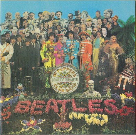
When you think of Sgt. Pepper’s Lonely Hearts Club Band today, you inevitably picture that incredible album artwork as well as the songs. That cover, with its 57 different distinct figures pictured, became a high water mark. They also included cardboard cutouts inside, a gimmick that Kiss were eager to copy and make their own. Sgt. Pepper’s artwork cost 60 times more to create than the average album cover in 1967! It took a band with the success of the Beatles to push the limits in this way.
The Rolling Stones included postcards in their Exile on Main Street (another unforgettable album cover), but they also brought album artwork into three dimensions. Sticky Fingers featured a working metal zipper, with which you could open the jeans on the front cover, to reveal briefs inside. It was a level of interactivity previously unseen. The zipper tended to cause damage to the records and packaging in shipment, but pioneering is a process of trial and error!
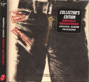
Early 90’s CD reissue of Sticky Fingers with zipper
Perhaps Led Zeppelin took LP artwork to its end point, with 1979’s In Through the Out Door. The record was concealed in a sealed, stamped paper bag that looked like a cheap bootleg, but inside would be one of six different album covers. You would not know which you got until you tore it open. The Grammy award winning packaging also included an inner sleeve that one could paint on, just by adding water! If you wet a paintbrush (or anything, for that matter), you could dissolve paint embedded in it and colour it yourself. Finding an original unpainted inner sleeve is the goal of a true collector.
Historically speaking, album artwork like this had several purposes. The first and most obvious would be to identify the product inside (something Led Zeppelin messed with by not including their name on Led Zeppelin IV). The second purpose was to attract the eye, in the crowded shelves of the record store. It was noted by many that a brown cover just melted into the background. Something striking would jump out, and be hard to miss in the racks. Another job of the cover art was to tie together all the related marketing for the LP. The artwork could appear in magazine ads, posters, and later on, in music videos.
The purpose of cover art that Kiss embraced was to give value for the money. Not only did you get killer artwork with loud rock and roll inside, but you also got a cardboard Love Gun, or even masks you could cut out and wear. Fans drooled over these extras. For a while, any time Kiss put out an album, you knew that the packaging would be special. For albums such as Destroyer and The Elder, they even used gatefold sleeves – an added, unnecessary expense for single LP packages.
Album artwork suffered in the 80’s and 90’s. With cassettes and ultimately CDs replacing the 12.375” width of an album cover, the pictures were smaller and less striking. You could not pack as much information onto a 4.75” CD sleeve. Iron Maiden’s artist Derek Riggs was known for hiding secret messages and logos in his album covers, including a mischievous “Indiana Jones was here” and “Wot, no Guinness?” inside Powerslave. These touches are lost on smaller CD covers.
There is no question that the majority of cover art suffered in the 90’s. Some bands and labels still strove to give the buyer some extra value, but the canvas was now teeny tiny. Tool are an example of a band who took advantage of the CD age. Their AEnema CD had lenticular, “moving” cover art, thanks to a special jewel case that enabled 3D images. You could even swap images by folding the booklet differently, and get a different moving scene. Kiss copied this, less successfully, for Psycho-Circus in 1998. Coloured plastic jewel cases were another way to get some attention on the CD racks. Bands such as Alice in Chains and Collective Soul used coloured jewel cases for their self-titled albums in 1995, but these were fragile and prone to scratching. The cardboard digipack was another method to enhance CD cover art, but they were not popular with everyone. Some consumers complained that the covers wouldn’t fit properly into their CD towers, and would scratch up the discs if poorly designed. And then of course, we had artists such as Garth Brooks who decided to milk the fans by releasing the same album with different cover art, encouraging them to “collect them all!” His Double Live had no less than seven covers to collect. That would come to well over $150 total for the collector who had to have each one.
LPs are currently having a second surge of popularity. Will it last? No. Before you cry “heresy!”, remember that in today’s society, convenience is king. That means portability. Vinyl LPs are meant to be enjoyed at home. The future will remain digital, although LPs will probably never die completely. The advent of digital music has reduced the importance of cover art yet again. You don’t need a cover, obviously, to enclose something that does not physically exist. Yet, cover art is still being made.
Some have chosen to take cover art in the digital age to minimalist extremes. U2’s Songs of Innocence was initially released digitally, with a very plain photo of a white LP sleeve with “U2” stamped on it. Kanye West embraced minimalism on Yeesus, releasing the CD with no packaging to speak of at all. A CD housed in a clear jewel case, sealed by a strip of orange tape, and a sticker with some credits – that’s all Yeesus gave us, surprising many by not going completely over the top with it. It’s still an artistic statement, but is it the kind of art that a fan will embrace and cherish?
I feel that album artwork is currently in a state of flux. LPs are having their moment again, and with them, lavish packaging that one can handle and enjoy. On the other hand, simple digital pictures are all kids need today, to be attached to their mp3 files. I hope that some enterprising, artistic individual, a modern day Alex Steinweiss, will innovate and bring back cover art in a lasting way. I sure hope, because I do like cover artwork to accompany my music.


