GRAB A STACK OF ROCK With Mike and the Mad Metal Man
Special Re-Run
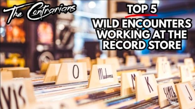
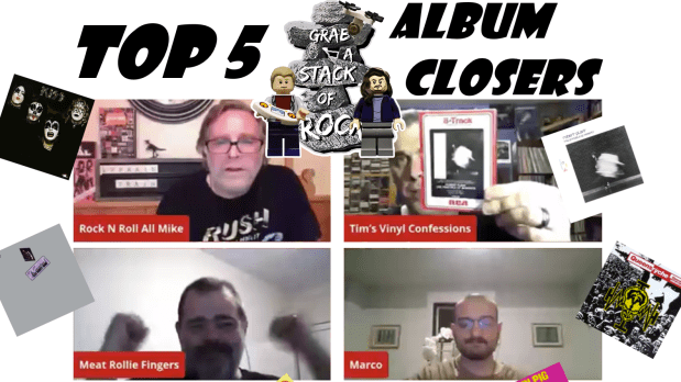
Top Five Album Closers – LeBrain Train Re-edited
This was a great episode! Originally run on October 15, 2021, the live stream was roughly two and a half hours long. Far too lengthy to watch in 2026, we have brought this episode down to a perfect hour. Where was Harrison that night? Active in the comments, and watch out for a memorable “Bleep!” comment from Uncle Meat to the Mad Metal Man!
On hand that night were Tim Durling from Tim’s Vinyl Confessions, and his fellow Contrarian, Marco D’Auria, along with original cast member Uncle Meat. The show was a sequel to Top Five Album Openers, two weeks prior. We decided to follow up with the Top Five Album Closers of All Time, and with the input of these fine panel members, this was an entertaining show that we are very proud of. The chat was brisk and informative. The lists (at bottom, if you don’t feel like watching, although you should!) were diverse and full of great closing songs that you may not have heard. It was a more challenging set of lists than Album Openers was, and there was very little crossover. Many excellent selections from the mainstream to the obscure. We also included a number of “bonus tracks” at the end: the runners-up that were just as exciting as the songs that made our lists.
Thanks Tim, Marco and Meat for helping to create a must-watch episode. Enjoy!
Friday March 20 at 7:00 PM EST, 8:00 PM Atlantic. Enjoy on YouTube or Facebook.