art

#1149: Eddie’s Story – The Narrative of Derek Riggs’ Iron Maiden Art

RECORD STORE TALES #1149: Eddie’s Story – The Narrative of Derek Riggs’ Iron Maiden Art

Edward T. Head, better known as “Eddie”, has been Iron Maiden’s mascot since the late 1970s.  He was just a mask then, made by roadie Dave Lights, to hang on the band’s live backdrop.  Why “Eddie”?   Because the mask was essentially just a head, or “‘ead” in British slang.  Therefore:  Eddie the Head!  When Iron Maiden were signed to Capitol Records, manager Rod Smallwood wisely surmised that the band would do well with an identifiable “stamp”…like a mascot.  He contacted artist Derek Riggs, and before too long, Eddie made his painted debut on the cover of Iron Maiden’s 1980 single “Running Free”.

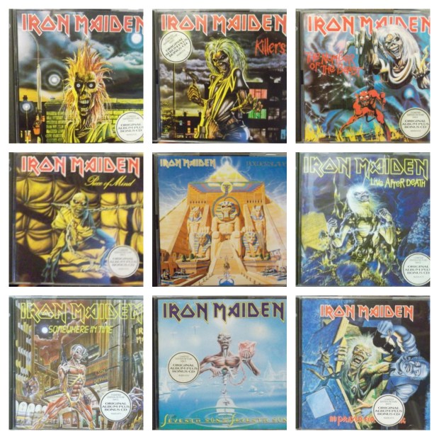
Eddie’s impact cannot be overstated.  He is more recognizable than any single member of the band.  He is seen on T-shirts worn by diehards, casual fans, and even those who have never heard an Iron Maiden song in their lives.  He is ubiquitous.  Needless to say, Rod Smallwood was very wise, and Derek Riggs very talented.  Riggs did the cover art for every Maiden album from 1980 to 1990, and almost every single and EP in the same time frame.

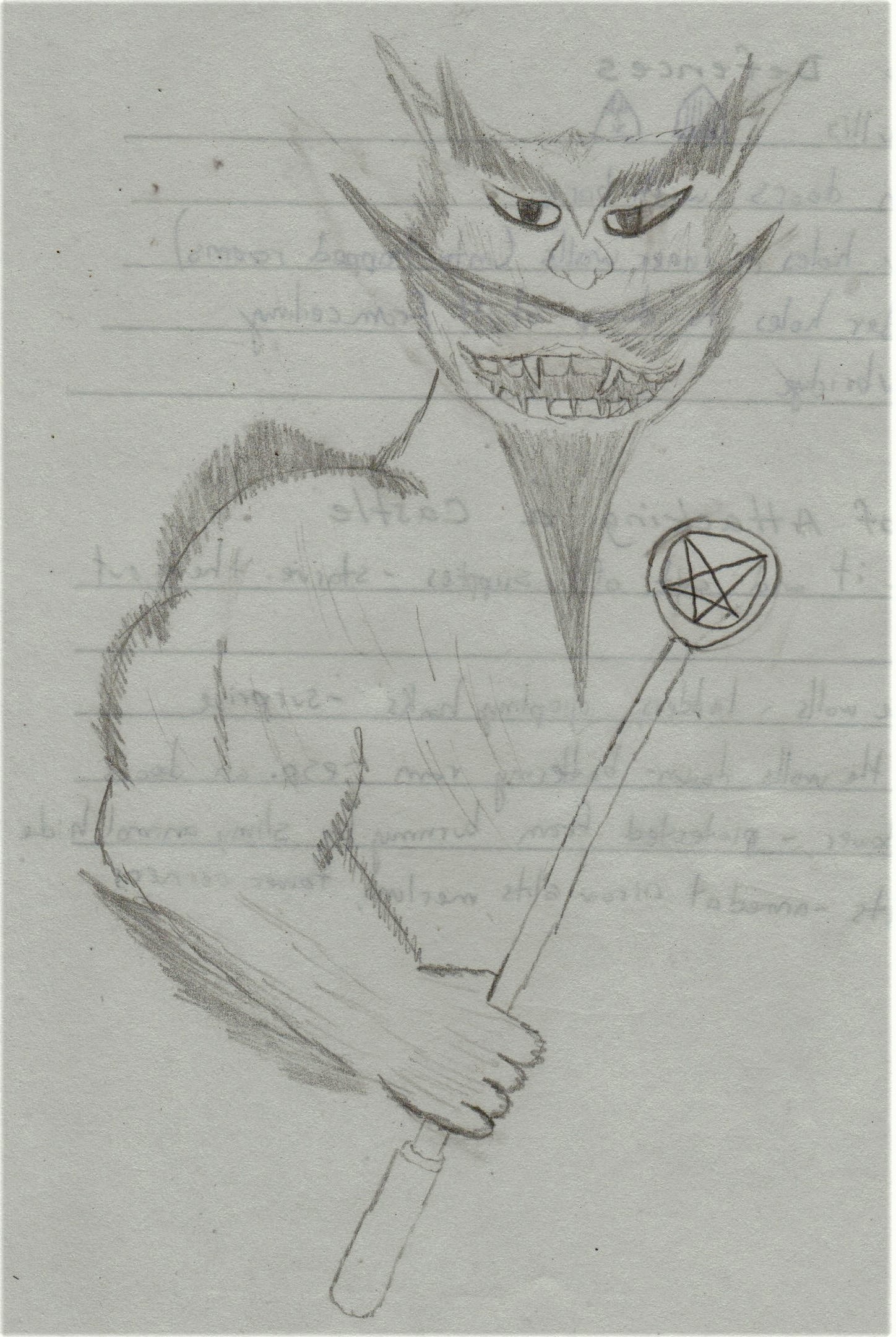
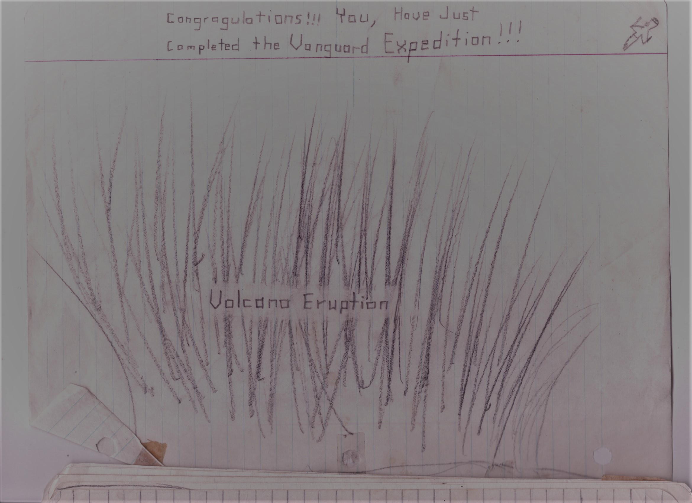
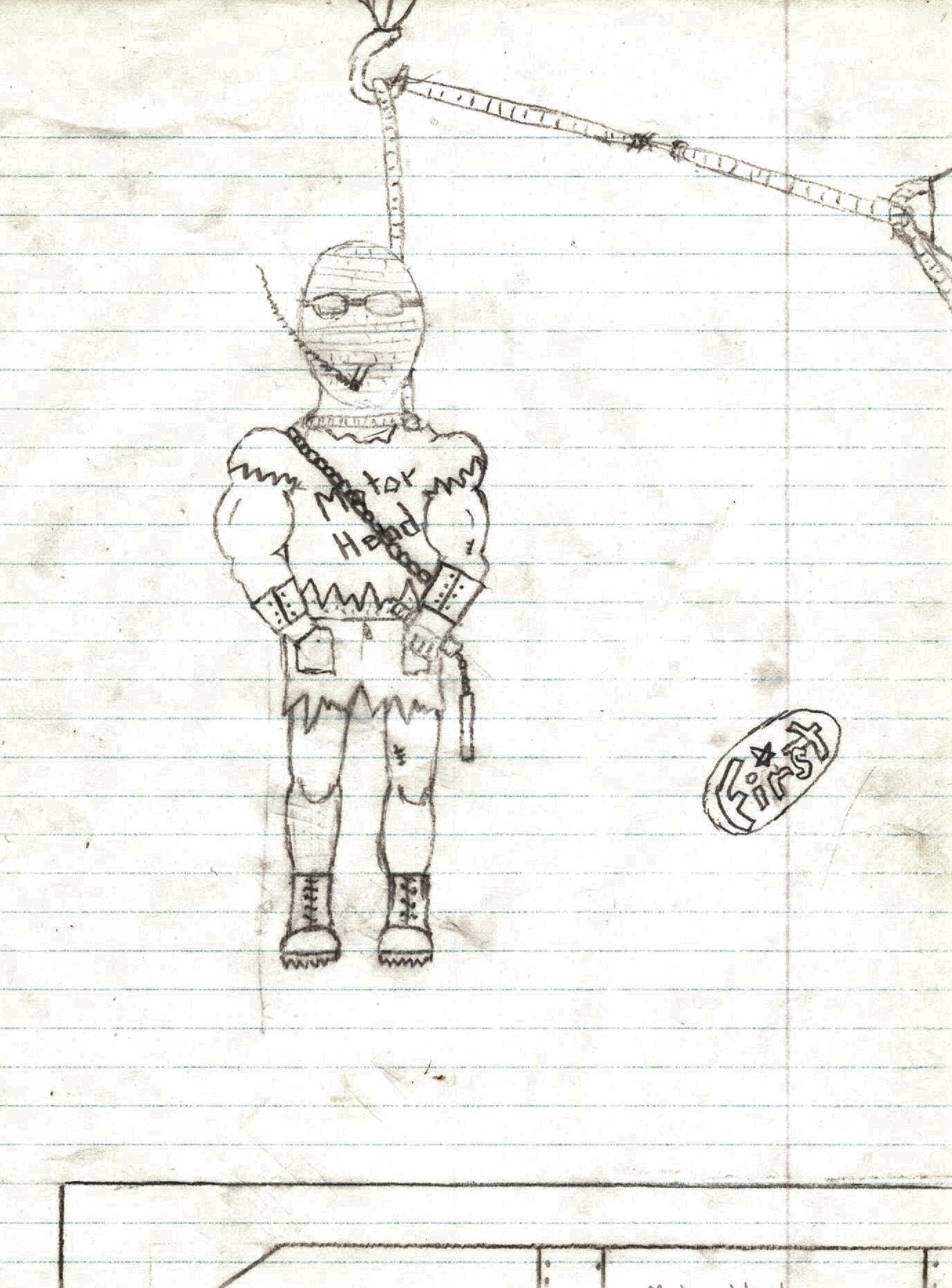
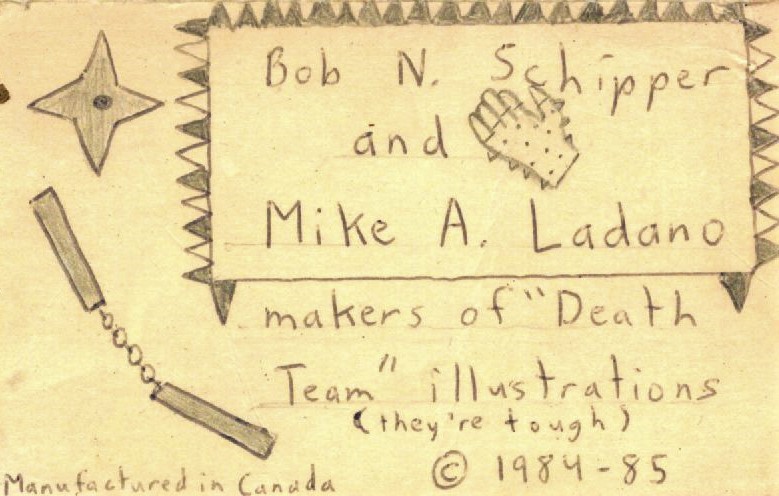
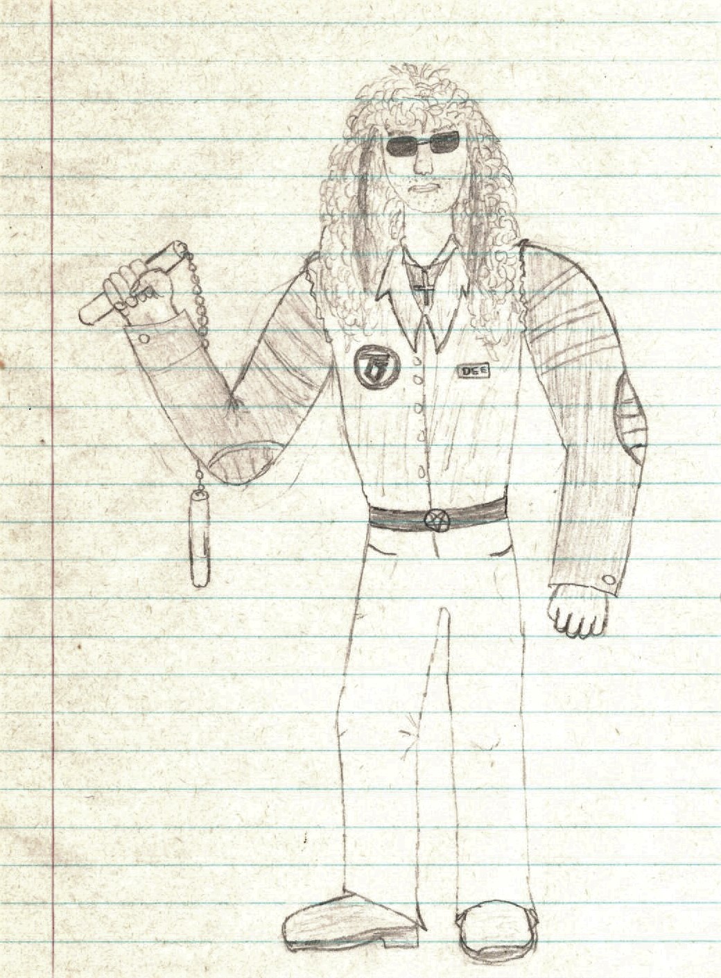
As young impressionable kids growing up in suburban Ontario, we certainly knew who Eddie was.  My friends and I collected not just the albums and singles, but also the buttons.  We were intimately familiar with Eddie, his different outfits, settings, and crimes!  We attempted to draw our own Eddies.  I took a shot at a single cover for “The Duelists”, a favourite song.  It featured Eddie and the Devil fencing at the edge of a cliff.  The Devil was a foe of Eddie’s going back to the “Purgatory” single cover.  Derek Riggs eventually built an extensive mythology for Eddie and associated characters.  He focused on “Easter Eggs”, hiding characters and symbols within the artwork.  Powerslave and Somewhere In Time were chock full of such goodies.  References to the bars Maiden played, the Reaper, and even a TARDIS can be found on those albums.  One of the great pleasures of being an Iron Maiden fan was opening up an album and looking for all the secret images and messages while you played the records.

By 1986, some of us had noticed that the album covers, not including the singles, seemed to a tell a continuing story.  There was a continuity to the cover art, and Eddie in particular, that made us think there was an actual story unfolding with each album release.  This story seemed to run through Derek Riggs’ entire tenure as Iron Maiden’s cover artist, from 1980 to 1990.  While I am certain that this is entirely something made up in our heads, it does seem to hold water.

Let’s have a look at the album covers, and the story they may tell.
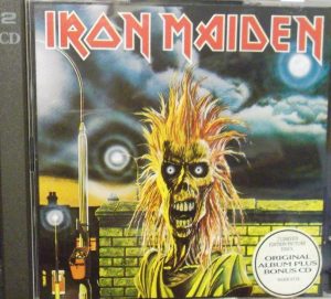
IRON MAIDEN -1980

Just an introduction to the character.  Eddie is a street punk, in a loose T-shirt, standing on a London street at night.  Behind him is a lit doorway, and a window with a red light – a reference to “Charlotte the Harlot”.  You can also see two of the streetlamps behind Eddie form an arc, with the moon.  Eddie’s eyes are just black sockets with light behind.  Later artists would change Eddie’s eyes, but Riggs always painted them black with some kind of illumination.  Eddie’s skin appears yellowed and stretched, like that of a mummy.  His hair is pure punk rock.

The story has yet to begin, but Eddie is clearly someone you don’t want to mess with on a London street at night.
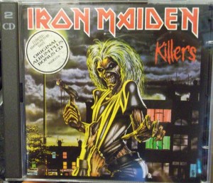
KILLERS – 1981

Eddie appears much more refined in this image.  You get a better look at the character, including a belt and blue jeans.  The punk rock hair is gone, though Eddie remains on the streets.  It could be the same neighborhood as the first album.  The black clouds in the sky are similar.  This time, Eddie has a bloody hatchet in hand, while his victim grips his shirt in dying desperation.  Eddie seems to have no mercy.  He even seems to relish killing.  Fitting, for an album called Killers.  Our interpreted story begins here, with a murder.

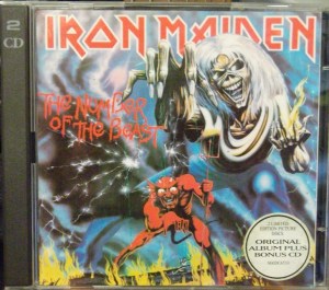
 THE NUMBER OF THE BEAST – 1982

The plot thickens.  In Riggs’ best album art to date, Eddie appears a giant over a scorched, hellish background.  The rear cover had more of this scenery, indicating we were indeed in hell.  Eddie’s eyes are now lit by flames, matching the ground below.  He also has a fire in his hand, a reference perhaps to Montrose’s “I’ve Got the Fire” which was an earlier B-side.  The most striking feature here though is the appearance of the red Devil himself!  Eddie appears in control, manipulating the evil one with green puppet strings.

This was the first cover that really had us squinting at the details, on our little cassette J-cards.  For if you look closer, you will see Eddie is not in control at all.  Satan himself has his own puppet, and it is Eddie!  Our minds were boggled.  What could this mean?  We began pulling together the threads that seemed to be telling a story.  Derek Riggs had outdone himself, but he was only getting started.

 PIECE OF MIND – 1983

Imprisoned!  Captured, chained in an asylum, and lobotomized to boot!  Now bald, Eddie bore a scar across his head!  He had been cut open like an egg, and this scar would remain for the next several album covers.  Two more details were added:  a stream of blood going down his nose (always his right side), and a metal bracket holding his head together.  The screws in the bracket would always be in the same orientation.

Clearly, Eddie was in trouble.  We saw this as the punishment for his crime of murder.  The Devil came to take his due, and now Eddie is stuck in a cell.  Would he escape?  The next album told us no.

Of course, the real life inspiration for the artwork was the title Piece of Mind.  On the inner sleeve, the band members are preparing to dine upon a brain!  It doesn’t look tasty, and Adrian Smith in particular doesn’t look hungry.  In our childhood fantasy world, the Devil had served up a particularly brutal punishment for our favourite Metal mascot.
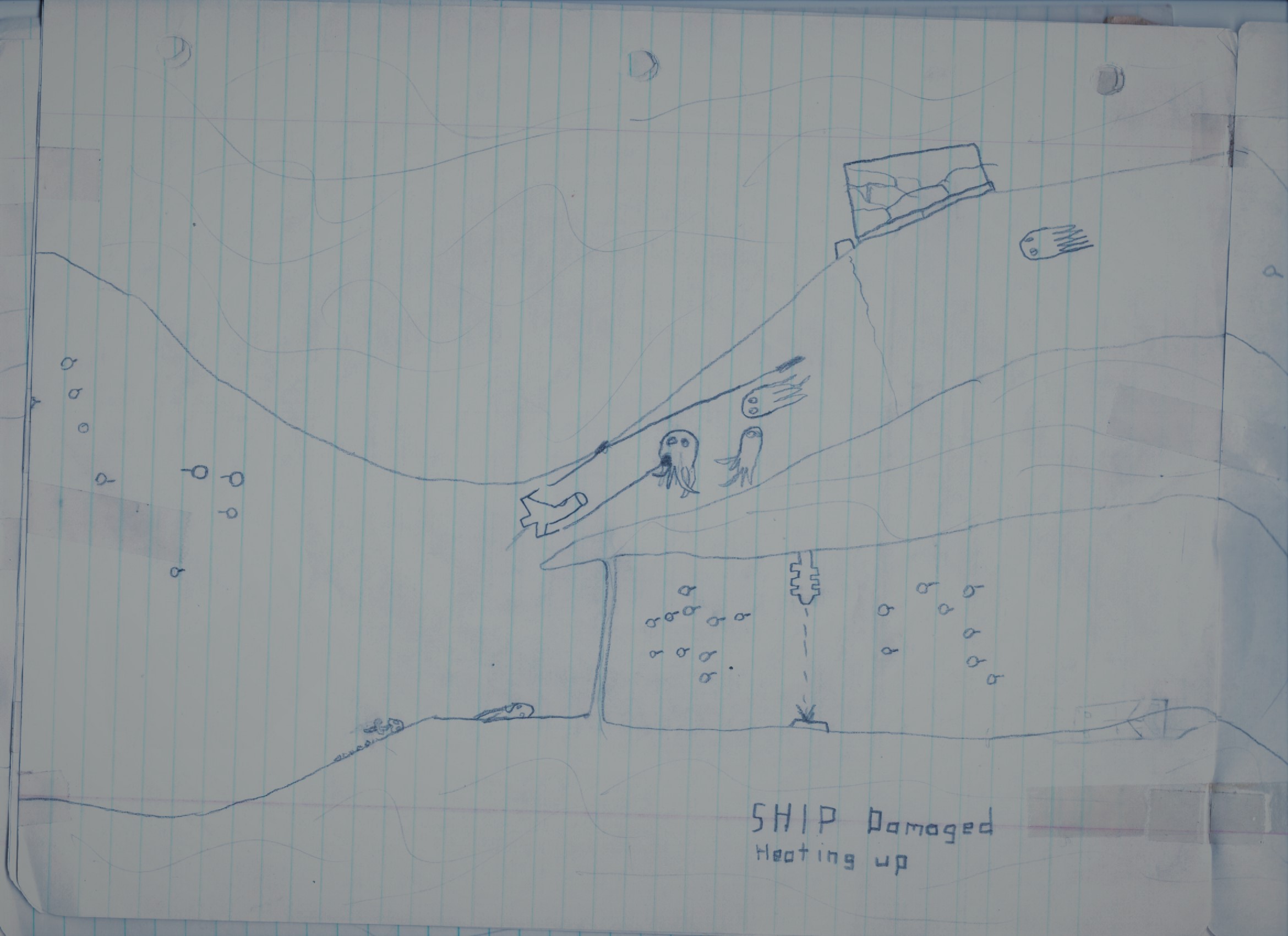
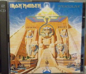
 POWERSLAVE – 1984

It appears that Eddie did not survive his brain surgery and imprisonment, for here he was being laid to rest in an ancient Egyptian setting.  In Riggs’ best artwork to date (again), a multitude of Easter eggs were hidden on the front, back and inner sleeves.  The Great Pyramid appears as it once did in antiquity, smooth and topped by a golden capstone.  Eddie’s sarcophagus can be seen, carried up the stairs, to his eternal resting place.

Or was it?

It seems pre-destined that Maiden’s next album would be called Live After Death.  It was really at this point that we started to put together that there was a story unfolding here.  Live After Death, and Eddie was buried on the previous album?  It all made sense!

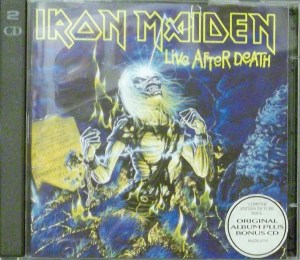
 LIVE AFTER DEATH – 1985

Now this was an album that simply had to be owned on vinyl.  There was text to be read on the tombstones (“Let It RIP”), and so many Easter eggs on the back cover, including a black cat, the Reaper, and a visible “Edward T. H…” on his tombstone.  For many of us, this was the first indication that Eddie did have a last name!

With a bolt of lightning re-animating the already dead corpse, Eddie was back!  Still wearing his chains from the Piece of Mind album cover, Eddie’s hair had grown back while his T-shirt has seen better days.  Flames can be seen bursting from the ground, hinting at his hellish past.  On the rear cover, a city can be seen, surrounding the pyramid from the last album.  The continuity seemed clear.  The only issue here was that on the prior album, Eddie was laid to rest inside the pyramid.  Here, he is seen bursting out of a normal grave.  It would seem that Eddie’s remains were re-located between albums.  A minor issue easily explained away.

The city on the back cover calls to Eddie!  He was back, and up to his old ways again…

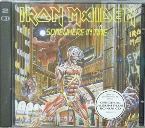
 SOMEWHERE IN TIME – 1986

Riggs outdid himself again, with the Blade Runner inspired Somewhere In Time.  Owning this album on vinyl is simply a must, for there is so much going on.

Still lobotomized, but bearing a new brain of circuitry, Eddie was technologically enhanced.  The blood, scar and bolts holding his head together are still visible despite the modifications.  On his chest, Derek Riggs’ signature emblem can be seen clearly.  It was always hidden somewhere on his albums, but here it was plainly visible.  A poster that reads “EDDIE LIVES” can be seen on the right, with the dying hand of a victim that he has just exterminated.  Back to his old killing ways from the Killers album!  Instead of a blade, Eddie now wields a pair of blasters.  Eddie seems to have arrived in a “Spinner” vehicle, similar to Blade Runner.

The same familiar moon from previous albums blazes behind, but there is so much on the back cover to discover too.  A reaper, red-lighted windows, and the names of things important to Iron Maiden’s lore are present.  As far as our story went, we imagined that Eddie emerged from his tomb centuries in the future.  This time, the Devil would not stop him!  But despite the cybernetic enhancements he underwent, his body was not whole…and soon it would be time to be reborn.

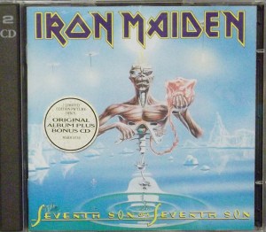
 SEVENTH SON OF A SEVENTH SON – 1988

This is where things got weird.  Really weird.  Not content to keep drawing Eddies with axes through people’s heads, Riggs went abstract on Seventh Son of a Seventh Son.  Eddie was now little more than a torso, with his skull ripped open and aflame!  The scar, bolts and blood are still present (though the blood would be replaced by a mustard-like substance on the single cover for “Can I Play With Madness”).  The remnants of his cybernetic enhancements are still present, with one eye replaced by a robotic one.  He also still has a metal throat.  An apple can be seen within his ribcage, but most striking is the Eddie-infant he’s holding in some kind of embryonic sac!  This sac is attached to his ribcage with an umbilical cord.  An arc of lamps recalls the first album.  A “book of life” is present on the back cover, tying into the album’s concept.  There are also ice statues of past Eddies on the back cover, for a total of seven Eddies.

Look closely and you can see that the surface below is both solid and liquid, and the icebergs do not touch the surface.  In our story, this represented Eddie on another plane, as he gave birth to his successor – a new Eddie.

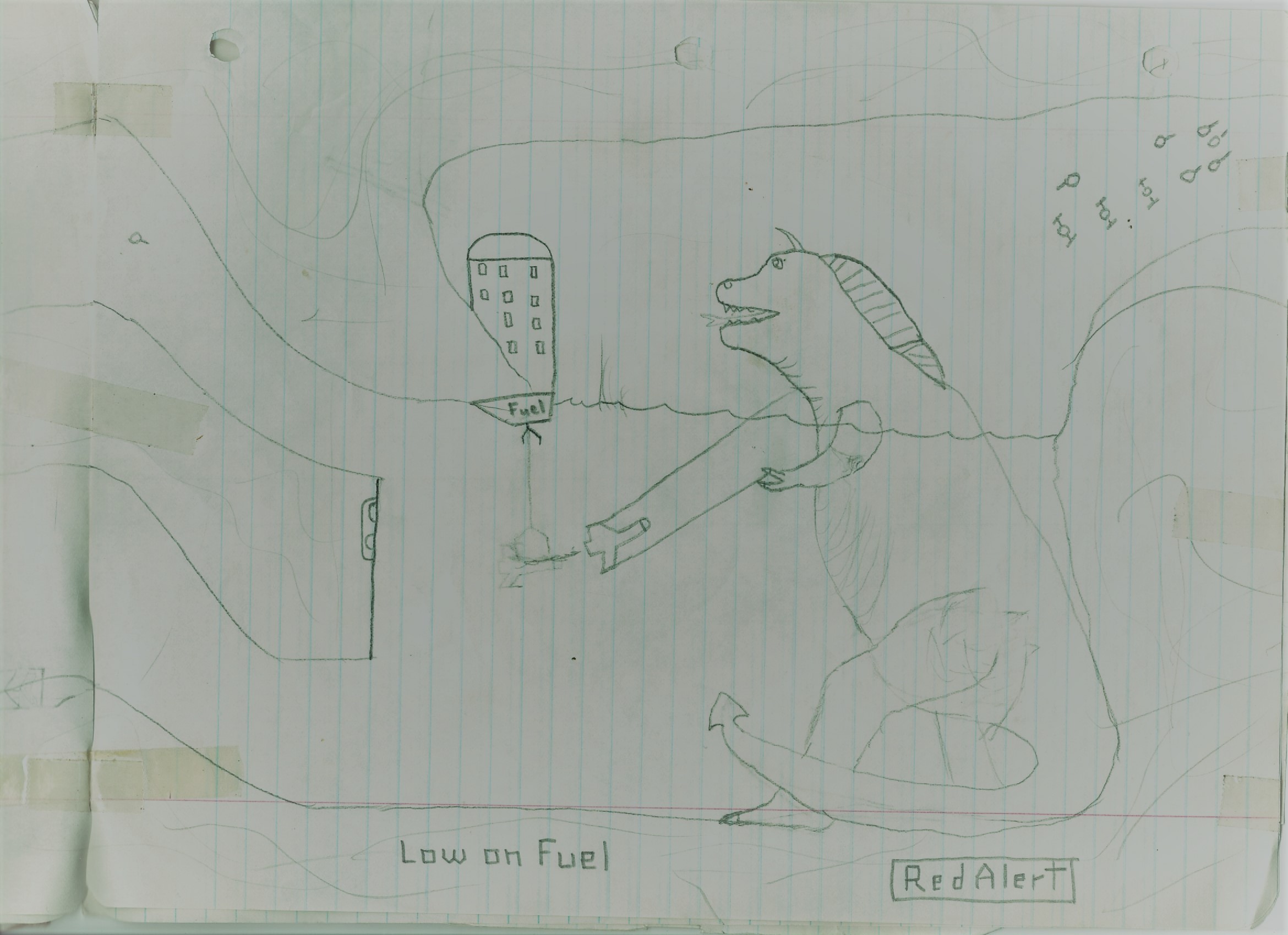
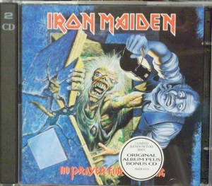
 NO PRAYER FOR THE DYING – 1990

For the first time, we felt disappointed by an Iron Maiden cover.  Gone were the layers of Easter eggs.  The art felt unfinished, and indeed, Derek Riggs would remake it for a 90s reissue.  The album was sonically a “back to basics” affair for Iron Maiden, with simpler lyrics and shorter, harder songs.  The artwork reflected this, with a simple Eddie just back to killing again.

Reborn, and without scars, bolts or lobotomies, Eddie emerges from a stone coffin.  Because why not?  The undead should surely be reborn in a grave!  Grasping the poor gravekeeper by the throat, Eddie is seconds away from his first killing in his new body!  Looking at his coffin, the name plate is unfinished, with no clever names or puns.  The fragments of the shattered coffin don’t even fit together properly.  The blue and yellow colour scheme definitely links the album to Seventh Son, Live After Death, Powerslave and The Number of the Beast, but there is far less to keep you looking at the cover.

And this is the end of our Eddie story, for Derek Riggs would not do another Maiden cover for years, and by then there was no point in any continuity.  The next time we see Eddie, he has red bug-eyes and is half-tree.

Iron Maiden would continue to produce fascinating album covers in the future, always featuring Eddie in some way.  Notable artists included Mark Wilkinson, Melvyn Grant, and Hugh Syme.  For most fans, the original run of Derek Riggs covers will remain the pinnacle of Maiden artwork, primarily the period of 1981 to 1988.

Did Riggs have a story that he was telling with his covers?  Probably not; he probably just liked keeping Eddie consistent from cover to cover.  He would probably appreciate the fact that a bunch of Canadian kids in the suburbs had interpreted this entire saga from his artwork.  I think he’d like that a lot.


#975: The Artwork of Sarge

RECORD STORE TALES #975: The Artwork of Sarge

As I’ve learned more about my friend Sarge since his passing, I’ve discovered something that comes up over and over again.  Sarge just wanted people to be happy.  He didn’t have to agree with them.  Whatever made them happy, made him happy.  He encouraged people to be individuals and find joy in their own skin.  I guess that’s one reason why he was such a great body piercer.  He was also an artist, as some of these pictures I’ve rediscovered prove.

During the period I knew him, I had a couple different online handles.  One was “Purpendicular” or just “Purp”, and I don’t need to explain to you where that came from.  After a brief hiatus I used Dewey Finn, a reference to Jack Black’s character in School of Rock, before reverting back to Purp.  Sarge made all sorts of art in that period for me, without me asking at all.  There were the infamous “Purp Ate My Balls” shirts.  There was also the artwork he made below.

My face on a Wheaties box, and why not?  The other day someone asked me if I’d ever wanted my face on a Wheaties box, and I said with a wink, “Already been there, man!”

And below, my face on a British tabloid.  And again why not?

With Sarge gone I’m so happy to be able to resurrect these bits of art that he did just for a laugh.  His laughs, and mine too.

Rest in peace my friend.

[Re-Post] Part 241: Halloween, KISS style!

Always nice to repost a seasonal classic.  Enjoy this Halloween tale.

RECORD STORE TALES Part 241:  Halloween, KISS style!

Our annual inventory count fell on October 31.  For five years straight, I never got to dress up, hand out candy, or do anything fun on Halloween because I was too busy counting discs and CD towers!  However in the early days, this wasn’t the case.  Halloween 1996 was actually a pretty good one.

Like most malls, ours had a few Halloween contests.  T-Rev entered the store in the Pumpkin Carving category.  He and I came up with the plan to do a Kiss pumpkin.  T-Rev, the store owner’s brother, and myself gathered in my mom’s workshop in the basement. My mom had plenty of paint, and I was good at drawing the Kiss makeup designs.  T-Rev had the idea to make the pumpkin Gene Simmons, and figured out how to make a pumpkin tongue stick out.  I must say he did an amazing job.

The first step was to spray paint the pumpkin white.  One of the guys did the cutting.  Then, I drew the Demon design with a black magic marker.  We thought the nose needed to be more three-dimensional, so I cut it out a bit.  Together, we began colouring in Gene’s makeup.  We needed something to define the eyes of Gene, and T-Rev thought of using pumpkin seeds.  We added a wig, and voila!

T-Rev propped Gene up on the magazine stand outside the store.  Immediately we started getting compliments, and the response was pretty unanimous:  We had done the best job in the entire mall.

Unfortunately, the judges didn’t base their ratings on who had done the best job.  They were only marking the results, whether the store employees did the pumpkins themselves or not!  A store that hired a professional carver won first place.  We came in second.  There was no prize for second.  T-Rev and I considered that to be cheating.  Cheatie-cheatertons.

The contest was over, and not too soon:  the pumpkin had begun to rot, as pumpkins do.  That didn’t stop a customer from coming in on November 1st and offering him $10 for it.  T-Rev accepted his gracious offer, even though the thing would be turning horrific in a day or two.  A fool and his money, right T-Rev?

By 1997, the store had moved out of the mall.  This was our last pumpkin carving contest, but at least we had the satisfaction of winning the popular vote.  As far as I’m concerned, we went out on top.  My personal consolation prize was later on, Halloween 2006.  By this time I had moved on to United Rentals.  They took Halloween very, very seriously at United Rentals!  I dressed up as Paul Stanley, and this time, I finally won first prize!

#915: I Was Young Tony Stark

RECORD STORE TALES #915: I Was Young Tony Stark

Bob and I used to fancy ourselves inventors.  We designed our own video game — Vanguard 2 — but we had our sights set much higher than just Atari’s throne.  Unfortunately many of our designs were thrown out over the years, but some fragments survive.  I know I had designs for 10 more video games, though they appear to be lost.  What was preserved indicates something far more ambitious.

According to the evidence at hand, we weren’t trying to be the next Bill Gates.  We were trying to be Tony Stark.  Alongside innocent designs for video game watches, are sketches for weaponized spacecraft, aircraft and submarines.  We were little weapons dealers!

It’s hard to pin an exact date on these designs but they are likely from 1984.  It appears I was working with a couple shell company names:  “Lado Industrial” and “Perseus Industries” are two.  Spelling is inconsistent throughout but you can get the gist of what I was going for.  Let’s have a look at these designs.


The Kid Looking to Weaponize Space:  The Perseus Industries 9000 (“P.I.N.T.”)

This spaceship resembles an oversized engine pod from a Y-Wing starfighter.  It is armed with rockets, lasers and proton torpedoes, apparently.  The landing gear is clearly designed after the F-104 Starfighter’s.

Also note that there were options.  For those with more expensive tastes, add on the detachable laser pod!


The Sea Was Not Safe from this Little Captain Nemo:  Unnamed submarine craft

Missiles, torpedoes, lasers and radar dot the surface of this heavily armed sea-beast.  A work in progress, it remains unnamed and unfinished.  Still deadly.

On the back of this paper, and almost too faint to read, is a note for our school principal:  “Dear Miss Beale, thank you for letting us have an Oktoberfest party, and thank you for inviting Miss Oktoberfest.”  They were Oktoberfest crazy at that school.  They would hammer that Bible into us and give me shit for wearing a Judas Priest shirt…but sure, have Miss Oktoberfest come to the school.


The Kid Wants to Light Up the Sky:  Perseus Industries King (“P.I.K.”) war jet

I’m not sure how well this this would fly.  Two laser turrets (ventral and dorsal) plus a forward facing laser makes this a heavily armed plane.  It doesn’t look particularly aerodynamic or stealthy.  It’s purpose was to punish!


The Weapons Dealer in Your Home:  Lado Industrial satellite TV system

Deviously, I named my home electronics company Lado Industrial.  Can’t have a weapons dealer selling video games to kids.  I was smarter than I thought I was!  One of the neighbours at the lake had a satellite dish and boasted that he could watch any major league baseball game he wanted.  This was clearly the future, the high-end of the TV experience, and I wanted in.

I created a sketch of the dish, the base mechanism, and the remote.  Note that the remote has a speaker/microphone and calculator functions.  While it may appear advanced, it is still a wired remote.


The Kid Had Ambition:  The Watch that Can Do Anything

I feel like Indiana Jones with only half the map.  This watch was not designed with Bob.  I was over at Allan Runstedtler’s house, and his dad had this crazy computer paper.  Sadly this drawing was torn in half and only the bottom remains.  Many details are lost, such as the name of the watch, and what company name I was planning to sell it under.  However, many details remain, and they are funny as hell.

Ignoring the horrendous spelling, let’s run through the features.

  • Double strap
  • Lifetime guarantee
  • 5 video game cartridges included: Defender, Pong, Pacman, plus exclusives Space Chase and New Slot Racers
  • 4 controllers included:  2 joysticks, 2 paddles
  • Pinball attachment
  • “Super battery” and recharger included
  • Built-in printer (“data readout”)
  • Built-in disc drive
  • TV plug-in cable
  • AM/FM/CB/shortwave radio
  • Earphone
  • 2000k built in, 16k add-on available
  • Detachable keyboard
  • Guaranteed to play “every game exactly the same as the arcade”
  • Blank cartridges available to copy games
  • And a strategy book (for strategies)
  • PLUS BONUS – We’ll give you a Pacman key chain free!

All this for just $299.00!  That is $200.99 off the original retail price!

Even in 1984 dollars, that’s a steal for all that stuff.  The watch would have been huge on your wrist, and the controllers and keyboard tiny by comparison.  There was no way anyone would be able to play a four player video game on a watch.  It’s also comical that with 2000k of storage built in, all you can add is a mere 16k expansion pack.  I guess the real hook was that it played “every game”, and “exactly the same as the arcade”.  With the video game cartridges included, it’s clear that my watch is primarily a gaming system.

“How cool would it be if I could sit there playing a video game on my watch without the teacher noticing,” I might have thought.  With the included ear bud, you could still get sound effects.

One visionary touch is the included pinball attachment.  This meant you could actually play Baby Pac Man — the video game/pinball hybrid that could only be experienced in arcades!  Well, with my watch, you could play it at home.  When I said “every video game” and “just like the arcade”, I was not kidding around.  I took that stuff seriously.


I was an ambitious kid with the streak of a warmonger.  I was a little Tony Stark in the making and the teachers should have been worried about that rather than a Judas Priest T-shirt or an obsession with Kiss.  All the clues were there.  Look at this one final drawing.

This school assignment came with a pre-drawn airplane cockpit.  It is captioned “If you could fly your own airplane, where would you go?”

Where would I go?  To war, apparently!

Surprise Guest & Lists! Top Cover Art Designers with Tim’s Vinyl Confessions, Aaron…and DAVE LIZMI!

I’ve said it time and time again:  the LeBrain Train is a show you have to see live.  Why?  Because you never know what is going to happen.  Case in point:  last month we managed to hook up an unplanned meeting between Andy Curran and Mike Fraser.  This week’s surprise was a drop-in from Dave Lizmi of The Four Horsemen!

As you may know, Dave was scheduled for a Friday night interview but had an emergency with his dad.  Saturday’s show was a planned Nigel Tufnel Top Ten list show with Aaron and Tim Durling.  We were talking about the Greatest Cover Art Designers.

As I was beginning the show, Dave messaged me to reschedule the interview, and at the spur of the moment, I asked him to sit in on the list show as well.  Dave went for it, and managed to come up with his own list with no preparation time.  Epic!

Your panel this week:

  • Yours truly (LeBrain)
  • Aaron (KeepsMeAlive)
  • Tim (Tim’s Vinyl Confessions)
  • Dave Lizmi (The Four fuckin’ Horsemen)

I can’t believe I just typed that.

History made today as a rock star joined a Nigel Tufnel Top Ten list for the very first time.  How cool is that?

Thank you Tim, Aaron and Dave for a great set of lists and a fun fun show.  From famous big names like Derek Riggs, Mark Wilkinson, Hugh Syme and Hipgnosis to more obscure artists, this was a great bunch of lists!  Lots of show & tell!


#900: Integrity Mix Again

[Integrity Mix] was an idea that came from Kevin.  For a while there, he was making a new mix CD every month, made up of the best stuff he was listening to in the last 30 days or so.  The idea was, you’d have a neat chronicle of your most impactful listening experiences.  And a good mix CD in general.  —  From Record Store Tales Part 46:  Integrity Mix


RECORD STORE TALES #900: Integrity Mix Again

In the years before beginning to publish my writings, I poured my musical creative energy into making mix CDs.  I spent hours on them.  I tested them in the car before giving them them “OK”.  I called them “Integrity Mix”, after one of Tom’s favourite words.  Integrity.  Music with integrity, people with integrity…that was Tom’s word.  The concept of the CD originated with Kevin, one of the guys I worked with at the very end of the Record Store.  Kevin and I had a falling out over the way I portrayed the store, but he deserves credit for many things, including these mix CDs.

The idea was simple.  Make a new mix CD every month (or so), made up on songs you were into during that period.

It was a great concept and one which I latched onto with gusto.  I made many, and some months ended up getting double CDs because there was just too much music that needed to be remembered.  Each one had a cover, though some were just simple track listings, some were more elaborate.

It’s fun to put things away and not look at them for a long time.  That’s what happened with these discs.  When I switched gears to writing on a daily basis, I wanted to listen to full albums.  Mix CDs started to collect dust.  I hadn’t looked at my Integrity Mixes for about five years, but noticed them in a corner and thought it might be fun to have a look.

What I discovered was, without even having to play a single track, I could see by much of the artwork just what I was into at that given time.  Here are all the covers I made with some kind of art:

February 2008:  Arrested Development

September-October 2008:  “Bird is the Word” via Family Guy

December 2008-January 2009:  Kenny Vs. Spenny

February-March 2009:  Battlestar Galactica

January 2010:  UFOs

February 2010:  Dedicated to my buddy Chris Thuss who had just left work

June 2011:  Super Troopers

May 2008:  Transformers

The music often reflected the shows I was into.  “All Along the Watchtower” is a key track on the Battlestar Galactica disc.  You can find tracks from movie soundtracks.

Kevin was right about doing that.  Looking back at these discs, the tracklists, and dates, I can clearly remember events from my life.  I don’t have to guess when it was — the discs are all dated.  Brilliant idea Kevin.  I feel bad that we fell out, and I’m sorry that I ever hurt him.  I hope he would have enjoyed that his idea had legs and I kept going with it long after we worked together.  Credit where credit is due!


#898: Vanguard 2

RECORD STORE TALES #898: Vanguard 2

Released to arcades in 1981, Vanguard didn’t catch my attention until it hit the Atari 2600 the following year.  While I have never played the arcade game, the Atari version was in my hands as soon as I could afford it.  Notably, the Atari game borrowed some of its music from Queen.  Vanguard was a scrolling space game, but where it differed from other games was that it changed orientation from side-to-side to up-and-down at points during the adventure.   There were a variety of adversaries, and power-ups to take advantage of.  There was even a “boss” to take out at the end, and then it all repeated over again at a higher difficulty.  We kids were in love with it, even the simplified Atari version.

Incidentally, Atari artwork and instruction manuals were excellent.  They often began with a short story — this one of the “Vanguard Expedition” into the “tunnels of Aterria” looking for a semi-mythical “City of Mystery”.  Enough to capture a kid’s imagination, especially when combined with the cool box art.

My best friend Bob and I, being the creative types, thought we could design a sequel.  We painstakingly drew every screen in pencil, one after the other.  There were 19 screens in total.  We taped them together in order with Scotch tape, so that you could lay the whole thing out on the floor if you so desired.  Each screen led into the next with attention to detail.

Bob and I had “designed” a dozen games already, drawing them on paper, but they were one or two screens at best.  Our Vanguard 2 was 19 levels!  Many heavily ripped off from Star Wars.  It was only 1983 or 1984 at the latest.  Although ours is completely unrelated to the actual Vanguard II that came out in 1984, out friends kept on telling us “You should send your ideas in to Atari”.  We were big dreamers but we had a lot of fun pouring hours of creativity into these projects.  I’m glad I still have some of them, including Vanguard 2.

I thought it would be fun to scan each screen and post the whole thing with commentary.  I tinted the old pages to give them some variety visually.  Check out the complete Vanguard 2 game!

Title page.  Our “hero ship” basically ripped off from the Colonial Viper from Battlestar Galactica.  Enemy ships show heavy Star Wars influence.

Screen 1.  Scrolling to the right.  Imagine continuous scrolling, as if all the pages were laid out on the ground.  Entering mountain!  Just like the first Vanguard, you must navigate a tunnel in your space ship.   Enemy craft, mines and drones ahead!

Screen 2.  A barrier to break through, and a choice of upper or lower tunnels to take.

Screen 3.  Upper tunnel was a trap!  Although you could possibly shoot your way through a weak spot in the cave wall.

Screen 4:  Switching out your ship for a submarine.

Screen 5:  More enemy resistance ahead, and a difficult choice of three tunnels to take.

Screen 6:  Bottom tunnel would have been the best choice.  Giant jelly fish and a 5 second force field power up ahead!

Screen 7:  Now it’s giant Octopii!  Your sub is running low on fuel, and there is a tempting fuel depot in the lower cave.

Screen 8:  The only way through these narrow caverns is to miniaturize your sub.  Then you must choose upper or lower tunnels, with the upper appearing easier.

Screen 9:  The upper tunnel has heavier resistance at a poor attack angle, plus a classic Atari-style bouncing barrier block, that you must time just right.  Success means deminiaturization and a new spaceship.

Screen 10:  Whether you take the upper or lower tunnels, you have plenty of opposition and the opportunity for a 5 second shield.  Either way — the Sarlacc pit awaits at the end of the screen.  (We would have called it something else.)

Screen 11:  Made it through the first mountain.  Passing through the energy barrier automatically “beams” you to the next screen.  (We called the mountains “Screen 1” and “Screen 2” since we envisioned it as a continuous side scroller, with only this one break in between.  Here I am calling the individual drawings “screens” as it makes more sense when you look at them individually.)

Screen 12:  Still scrolling to the right — entering volcano!  A choice of two tunnels ahead.

Screen 13:  Either way, both tunnels will lead you to a new ship, plenty of opposition, and a 7 second force field.

Screen 14:  Your new ship has dual lasers and can stand the heat of the lava lake you are about to enter!

Screen 15:  You’re heating up so don’t be long.  Upper tunnel offers some squidly opposition while the lower has plenty of enemy subs.

Screen 16:  You’re low on fuel, and a giant lizard is sitting right there by the fuel depot!

Screen 17:  Boss Level!  As in the first game, the Great Gond awaits you at the end.  He is protected by enemy ships and cruise missiles.  Once you beat Gond, we change orientation:  now the game scrolls up!  Make your escape through the cone of the volcano.

Screen 18:  Scrolling up as you try to outrace the flames of the erupting volcano beneath you, while being harassed by enemy ships and missiles!

Screen 19:  If you beat the flames, you win the game!

We could have had a hit video game on our hands!  We loved to draw and a lot of this was drawn outdoors.  I’m pleased the thing held together long enough for me to scan it.  Imagine that Queen theme playing as you win!

#880: Death Team

GETTING MORE TALE #880: Death Team

One of my favourite ways to spend a Saturday morning was down in the basement drawing pictures while listening to heavy metal music with my best buddy Bob.  Most likely, we were watching one of my VHS tapes of the Pepsi Power Hour while doodling away with our pencils.  It was the best of times, with the best of friends, and the absolute best kind of music.

In the early to mid 1980s, MuchMusic was only available on pay TV.  We had it, but Bob Schipper did not.  Therefore he only had two pathways to the Pepsi Power Hour:

  1. Wait for the one or two weeks per year when pay TV was free for sneak preview.
  2. I tape the videos, and share my finds with him on Saturday mornings.

It was an amazing way to bond as kids.  He brought with him his paper and pencils, and we would get down to business while watching music videos.

In the summer, we moved activities to the front or back porches, with a ghetto blaster playing Kiss or Iron Maiden as we sketched.   In fact, the story really begins on the back porch.  The very same back porch on which we schooled George Balasz about Accept.  Bob had mastered the art of drawing muscled warriors in cool poses.  His very first was a master of escape whom he dubbed “Motor Head”.  In his first appearance, he seems doomed, hanging from a noose.  But a closer look reveals him casually smoking a cigarette and holding a pair of nun-chucks for his imminent escape.  Note the frayed rope.  He was in no danger – he was biding his time!

Having mastered this first character, it was time to expand on the concept. Bob drew many different designs and body types. Giants, archers, characters with cybernetic limbs…the field was wide open, but heavy metal music was always an influence.

Bob’s second sketch was a man in a metal Quiet Riot mask he named “Killer”.  Killer was one of Bob’s favourites.  As his drawing abilities grew, he expanded upon Killer.  Next, he designed a custom car and robotic pet for the character.  I liked the way he used metal plates and rivets for detail.

Bob taught me the secrets of drawing these heroic figures, and I began to create my own warriors.  The characters we were sketching resembled Mad Max marauders, crossed with heavy metal tropes.  Really, all of that metal stuff was inspired by the post-apocalyptic fiction genre that was all the rage in the early 80s.  Nobody did it better than Mad Max, and many of our characters wore masks like Lord Humungous.  Others had bandaged faces, like Eddie in some of the Powerslave-era Iron Maiden artwork.  Some wielded ninja-like weapons, since ninja movies were also all the rage at the time.

We called our characters “Death Team”.

Bob’s backstory concept of Death Team was a school gang, with a strong influence from martial arts movies.  The idea was that the gang evolves into a government-sanctioned fighting force.  That meant no limits.  The cars and trucks that we drew were armoured and kitted out.  Very much inspired by M.A.S.K., Mad Max, and other shows of the time.  If there was something cool on the screen, we would try to draw it and add our own twists.  What I brought to the table was my interest in GI Joe comics, and the military side of fiction.  The ninjas were the common ground between Death Team and GI Joe, and many of my characters had weapons and outfits inspired by the comics.  I started giving my characters code names and bios, just like GI Joe, and gave them the inverted star sigil.

At this point during the earliest Death Team drawings, my sister and I had our big musical schism.  That means that up until 1985, she was into the same music I was.  Well…not W.A.S.P.  But she liked Quiet Riot, Motley Crue and Iron Maiden.  Then something happened, and she went into what I called “New Wave”.  Pointer Sisters, Corey Hart, Tina Turner.  To counter our heavy metal Death Team, she created her own squad called the Wavers.  She drew her own team members:  “Waver” and “The Wave”.  Needless to say, Death Team would have crushed the Wavers in combat.

Bob and I sketched solo, during the week.  Then we’d gather on the weekends to share our work.  We’d inspire each other and keep drawing more.   Those are the Saturday morning Power Hour sessions I remember so fondly.

One weekend, Bob came over excited that he had learned to draw “a really cool bike”.  He arrived at my door with his new character “Bike Ninja”.  We helped each other name our characters, but that one didn’t need anything fancier than simply “Bike Ninja”.  His boots had outward-facing spikes, and his left hand was replaced by a robotic claw with a laser in it.

“That might make it hard for him to ride his bike,” I offered up.

“Nahh!” said Bob.  “He’s a ninja!”

My mom noticed that many of the characters were smoking cigarettes.  She asked why that was.  Bob started putting cigarettes in some of their mouths (even the ones wearing masks) to make them look cooler, so I followed suit.  That was the rock and roll influence, as many of our rock star heroes like Eddie Van Halen were constantly smoking.  We had no interest in it, but the visual followed into our art.

Bob’s art was much better and more original than mine.  I improved over time.  By 1987 I had finally drawn one I was really proud of, a character all about street justice and inspired by Dee Snider from Twisted Sister.  In fact this character was meant to be the real Dee Snider, joining our team to save Earth.  The concept was stolen from Sgt. Slaughter, the WWF wrestler who joined the fictional GI Joe team.  If that could happen, then Dee Snider could join Death Team!

As Bob and I built our little world of characters on paper, we realized our gang needed someone to fight.  Bob was watching the Silver Hawks cartoon before school in the mornings, and took influence from some of the creatures seen on early morning TV.  We decided on a force of alien invaders as our adversaries, and a wide variety we did draw.

Bob was really the visual guy though; his drawings were so far ahead of mine.  I was more a conceptual guy.  I came up with the character bios and some of the overarching story.  It was hard bridging the street gang origins together with the alien invasion concept, but I wrote an origin.  Together, Bob and I wanted Death Team to be a Canadian team (with some American and overseas volunteers).  We wrote them as a down-on-their-luck school gang who lived together on the rough side of town, wherever that was.  They actually began as two rival gangs who combined their forces together.  We wrote the first pages together and then I finished writing the story.  The guys were so tough, that they were swiftly recruited by the Canadian government as a unit of street enforcers.  The Death Team was born!

I decided that the leader of the alien invasion was to be a human.  Perhaps inspired by Xur in The Last Starfighter, the alien leader was a former Death Team computer wizard who made contact with the aliens by sending a signal through a black hole.  He then defected and joined them, determined to conquer the Earth for his own.  We even named our alien alliance the “Xor Aliens”.

Bob was really good at drawing aliens, though most had human bodies with alien heads, hands and feet.  Some were covered with hair.  He was good at drawing big round mouths with a circular row of teeth.  I thought that was a cool visual.  Many of ours were aquatic.  Planet Xor must have had a lot of oceans.

When I look back at these drawings, I see a difference between Bob and I.  It’s quality vs. quantity.  His are better while mine are plentiful.  Some of mine were little more than outlines with no shading or depth.  Plenty of mine are rip-offs.  He was coming up his own ideas.  The thing we have in common, easily seen in these sketches, is how much fun we had!

The pinnacle of of our fun was realized one afternoon when we decided to commit Death Tape to an audio adventure.  One side of a 60 minute tape contains us acting out our favourite characters, in a series of adventures.  This is all done to the backing tracks of great hard rock tunes.  It opens with “In the Beginning” and “Shout at the Devil” by the mighty Motley Crue.  This meant we used two ghetto blasters in making this tape.  One to record, and one to play the backing music while we acted out the scenes.  Quiet Riot’s “Slick Black Cadillac” and “Caught in the Crossfire” by April Wine were the songs used for the other scenes.  I just remember having so much fun doing it.  It didn’t matter if the tape is unlistenable.  My face was red from laughing so hard that day.

All this Death Team stuff goes hand-in-hand with the earliest days of my discovery of metal.  You can see the influences bleeding through.  Characters named “Motor Head” and “Killer” and “Helix” and “Crazee” and “Iron Maiden”.  We weren’t terribly original, but we were terrifically entertained.  Entertained by ourselves!  All we needed was some paper, some sharp pencils, and a good song.  I can still hear the tunes playing, whether it was W.A.S.P. or Motley Crue or Iron Maiden themselves.  The tunes were critical.  The team could not have existed with the tunes, and the tunes were only more fun to listen to while drawing pictures of the team.

Later on in school, when I was much better at art, I tried my hand at doing a sequel team, called “DT 2”.  I played the music, and tried to recreate the magic by sitting down and drawing some updated ninjas.  Without my friend it was a futile exercise.  Death Team cannot exist without three things:

  1. Heavy metal music
  2. Paper and sharp pencils
  3. My buddy Bob

Anything else is simply a knock-off.

Sticky Note Art 2020

I started making sticky notes for live streams back in the spring.  It started with me simply writing “Are you ready for another Friday live stream?” and posting it on social media.  They got more elaborate from there.  Then I started saving them on my calendar.  Over the months, I kept some of my favourite sticky notes.  Here are some memories from LeBrain Trains over the past six months.


#768: Scanning the Notebooks

GETTING MORE TALE #768: Scanning the Notebooks

Mrs. LeBrain and I have been downsizing of late, and getting rid of old stuff we don’t need anymore.  In the process we have discovered lots of cool treasures we have been hanging onto.  In the last few months I’ve shown you a treasure trove of cassette and VHS rediscoveries, and things keep turning up all the time. The lady that helped us downsize, Elanda, didn’t understand why I needed to hang onto old yearbooks and CDs.  This kind of thing is important to me.  I’ve built an entire series of stories on nostalgia!  Preserving this stuff, to me, is preserving musical history.  It’s a part of the extended story of these bands.  It’s my autobiography.

Another great place to find old treasures is the parents’ basement.  I didn’t realize they hung on to some of my old, beat up highschool notebooks.  The covers are falling off, but like an archaeologist, I have to preserve this stuff for posterity.  Look what I found!

I didn’t just scribble band logos on my notebooks.  I painted them on.  My mother had a basement full of paints for her ceramics classes.  I had access to all the brushes, colours and textures you could ask for.  Most of the paints I used were water soluble, so I probably sprayed this binder with a clear coat to protect the paint.  30 years later, my artwork is still about 90% intact.

The Van Halen, Def Leppard, Dio, and Van Halen logos are self explanatory.  Look a little further.  I took the trouble of drawing Ratt’s titular mascot using three colours, including silver for his sunglasses.  The lightning bolts here are there are meant to be a reference to Frehley’s Comet.  (From looking over my homework inside, it seems I also signed my name with a lightning bolt.)  In the bottom front corner of the binder, “Dawn Was Here” was written on there by one of my sister’s annoying friends who took ceramics class at our house.

Digging inside, I discovered that I clearly put more effort into the front covers than my English homework.

Next to the very bored notes about American literature are more logos, more lightning bolts, a few grim reapers, and designs for multi-neck guitars.  More rats!  Cartoon portraits of Gene Simmons (no makeup; it was 1988) and Rob Halford.

Judging by my careless scribbles, it seems I was not a fan of Huck Finn.  The notes in English class are not legible and it looks like I didn’t do much homework.  That’s not to say I wasn’t working hard in class.  Some of the best sketches came from English class.  I obviously spent a lot of time on some of them.  A page called “Scenes of Death” looks alarming at first, until you look a little closer and notice that one guy is getting jumped by a giant Schnauzer.


And, of course, a giant page of logos.

Everyone had the giant page of logos.

Bob Schipper had the idea of calling our “band” Paragon.  “Not Paradox,” he stressed, “but Paragon.  It means we’re among the best.”  Our logo is the centerpiece of the page, coloured in yellow highlighter.  The entire page is like a “Where’s Waldo?” of bands and references.

My science and history notebooks are much cleaner.  Fewer band logos, more meticulously taken notes.  Still,  found of portrait of Satan in my History book.  I was trying to copy the style of Derek Riggs.

I’m grateful my mom and dad hung on to these books.  It makes up for my dad throwing out my Chopper Strike board game and damaging my ZZ Top Eliminator model.  There is still a ton more stuff at their place for me to go through, including a mountain of cool T-shirts that I forgot I owned.  My original Judas Priest shirt is there, the one that got me in trouble at Catholic school.  Imagine if ol’ Mrs. Powers at the Catholic school had seen my later Satan drawing!  I’m certain it would have raised concern and probably a meeting with my parents.

I’m glad I switched out from a Catholic grade school to a mainstream high school.  My logo and Satan drawing skills certainly flourished there, even if my appreciation for Huck Finn did not.